Princeton University
Visual Arts Program
VIS 415, I-n-t-e-r-f-a-c-e
Mondays, 1:30–4:20 pm
Spring 2022
This studio course builds on the skills and concepts of the 200-level Graphic Design classes. VIS 415 is structured around one semester-length assignment which connects graphic design to the design of software interfaces. The single project allows an individual in-depth investigation of a broader class assignment and will leverage the online setting with students working together to refine their individual projects through a mix of critique and user testing. Studio work is supplemented by guests, readings, and lectures. The course will explore information design and visual problem solving specifically for electronic media.
http://i-n-t-e-r-f-a-c-e.org
Print syllabus / Download readings
January 24, 2022
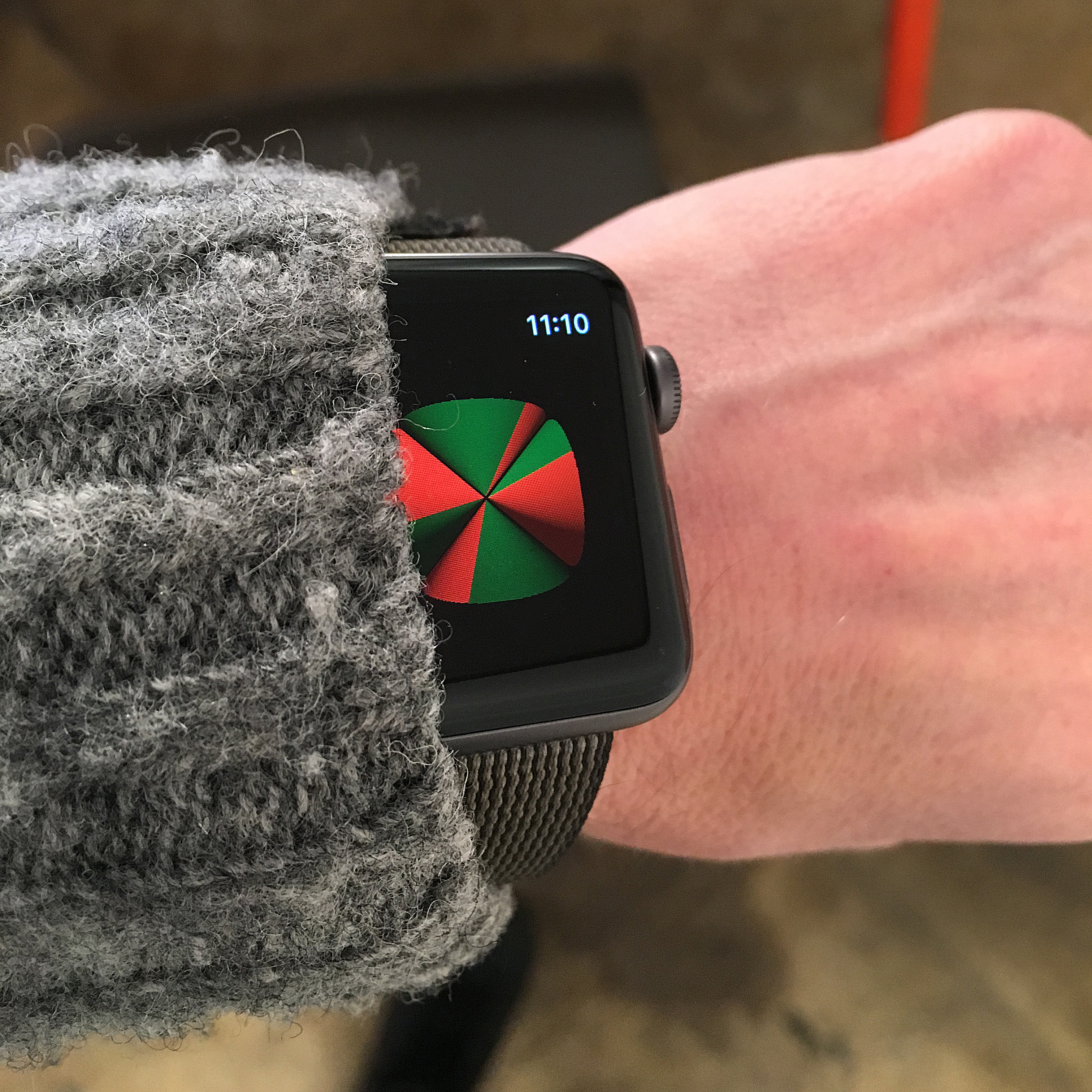
At the third stroke, the time will be ...
At the third stroke, the time will be ...
Resources
Work
Dial +44 871 976 2819, and you’ll hear this:
At the third stroke it will be 6:20 and 40 seconds. [Three beeps] At the third stroke it will be 6:20 and 50 seconds. [Three beeps] At the third stroke it will be 6:21 precisely. [Three beeps]
It’s a “speaking clock,” an automated electronic announcement which provides the current time. The distinctive voice belongs to Pat Simmons, a former London Telephone Exchange employee who spoke the time from 1963 until 1985. Simmons followed Jane Cain [↓], the “golden voice” of the first British telephone time system starting in 1936.
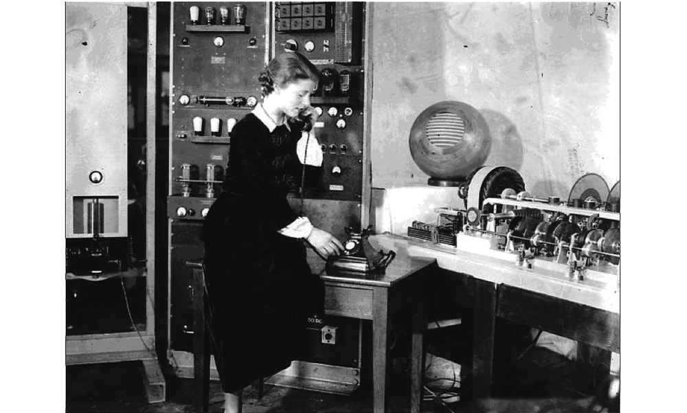
That first set up was a room-sized electric mechanism which produced an automated announcement from glass disk recordings of spoken audio bits. Here is Pat Simmons [↓] recording numbers and sentence fragments.
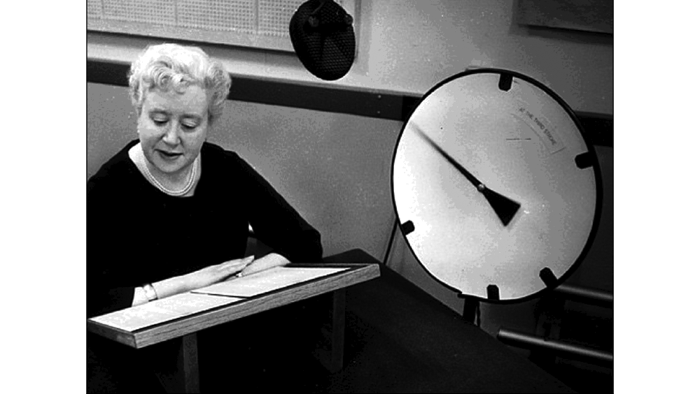 Dialing “T-I-M” from any UK telephone at the time set this elaborate machine running. Before this, speaking clocks were delivered live by an operator sitting in front of a clock face, answering phone calls, and reading out the time [↓].
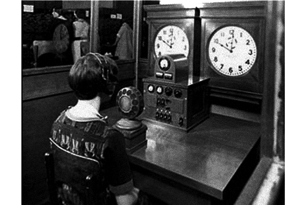
Of course what you hear live when you call the number above depends on exactly when you call. The voice, well that’s not so live. Simmons spoke the clock only from 1963 until 1985 and this service is a software simulation run by enthusiasts at telephonesuk.co.uk. Live, recorded, or programmed, a speaking clock is clearly an anachronism. But, it also provides a crisp model for thinking around something quite contemporary: the interface.
Jane Cain: At the third stroke it will be 8:57 precisely.
Pat Simmons: At the third stroke it will be 7:02 and forty-seconds.
Man’s voice: At the third stroke the time sponsored by Accurist will be 10:52 and 10 seconds.
Each has a particular quality and it’s easy enough to imagine those voices as the personality, or even the design, of this interface. Call the speaking clock and you’re interacting with a front end, a “user experience”—you’re given a simple friendly face for a complex process which remains hidden.
Whatever lies between is called interface. Whatever allows us to link to different elements, to reconcile them, to put them into communication.
That definition was offered in 1987 by Italian critic Giancarlo Barbacetto in his introduction to Design Interface. The book chronicled the Olivetti Typewriter Corporation’s early attempts at designing user controls for photocopiers, computers, typewriters, and calculators. Barbacetto places this design task in a broad cultural and temporal context. Appearing opposite his introduction is a reproduction of the Rosetta Stone, offered up as a kind of original, ur-interface—a shared surface which facilitates communication between otherwise irreconcilable languages and cultures. The Rosetta Stone [↙] records three different languages all relaying the same message. The recovery of this “shared surface” in 1799 allowed the deciphering of Egyptian hieroglyphs.
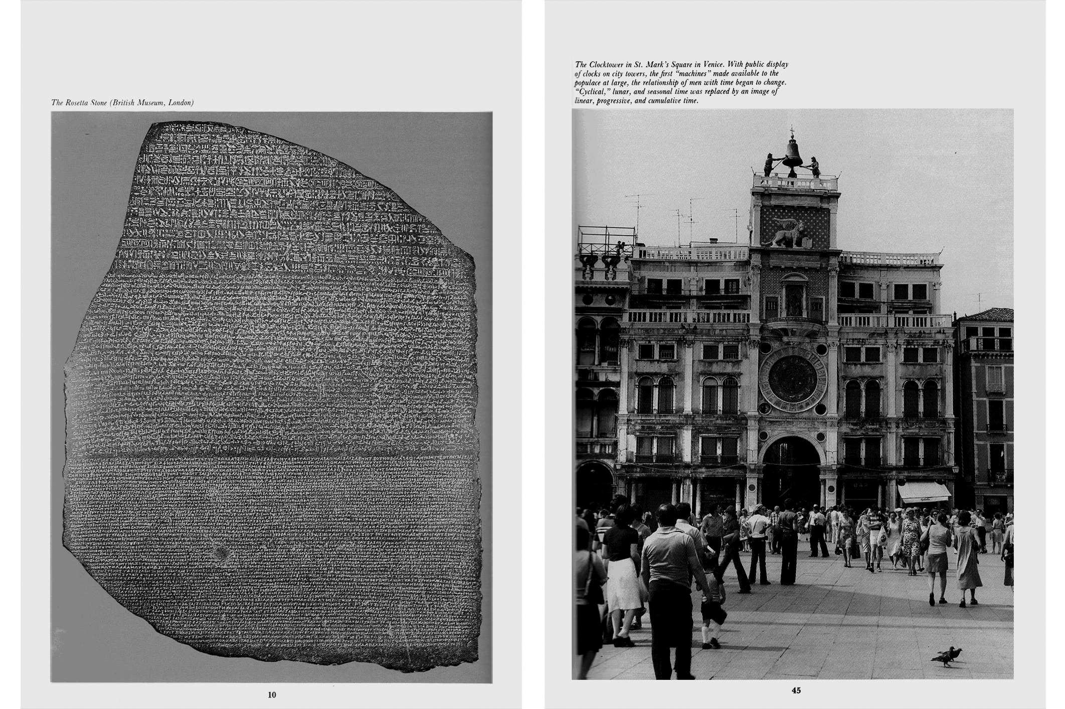
Barbacetto continues from the Rosetta Stone to an impossibly broad scoping of the concept of interface and lands on this, a public clocktower in the Piazza San Marco in Venice [↗]. It’s the first public clock and it’s set at the center of a merchant city, where shared time would have significant consequences for shipping and commerce. He goes on,
An extremely powerful and everyday filter is the clock. The first machine made available to all from high atop a tower ready to interface humans and time. The clock tore humans away from lived time marked by natural rhythms and by the duties of seasonal social labor and delivered into the power of measured time, objective and abstract. The work time of urban merchants, the interest time of the money lender, the factory time of industry. First the bells of the city clocktower, later the mill siren, erased cyclical time that moved, the rhythm of the seasonal return, of a certain kind of game, the ripening of a plant, the dependable rising of the sun. Cyclical time was a great exorcism of death—the moon that returns is the first dead man returning, repetition is the life of the world, history is nothing but the reiteration of a single original event; time is Kronos, the great primordial judge.
After the arrival of the clock all that became a memory and a myth. Time became linear, homogenous, empty, irreversible, cumulative, oriented towards a goal. Even modern mechanical thought prefers rectilinear motion to circular motion. Clocks mark the separation between work time (the value time of production), and free time, but today even the physicality of the chimes of the clocktower is obscured by the digital information time, the absolute acceleration of the discontinuity in the contemporaneity of computer time.
Olivetti’s first large computer (built in 1959) was named the Elea, after the colony in Magna Graecia where, in the fifth century B.C. the school of philosophy of Parmenides and Zeno was born. “Elea computer”—the name itself is like saying mathematical rationality and philosophical discourse, algorithm and hermeneutics.
(“Algorithm and hermeneutics” or in other words, a definite pattern and how things get their meanings.)
January 31, 2022
Zapotecs & Pulsars
Zapotecs & Pulsars
Reading
From-Sundials-to-Atomic-Clocks.pdf (Jane Fitz-Randolph and James Jespersen)
Resources
Work
Exercise #1, What time is it?
Monte Albán is a pre-Columbian site above Oaxaca, in central Mexico which I visited in 2015 with my parents-in-law, who had been there several times before. I was struck by the overlap of past and present at the site, where an ancient Zapotec city and its foundations overlook the modern city of Oaxaca.
One afternoon, my father-in-law led us up the back way toward Monte Albán. As you crest a small hill, this [↓] is what you see—just an expanse. The scale is a bit hard to take in at first. It’s gigantic.
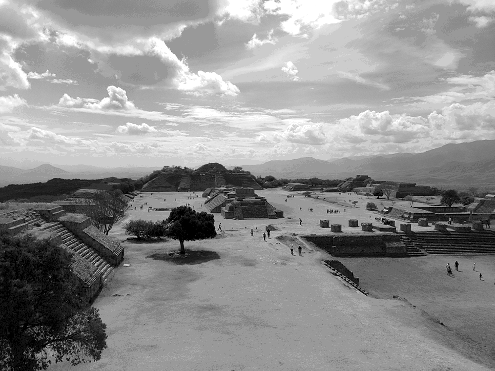
It has a regular orthogonal layout of pyramid structures, inset with ceremonial grounds entered by the steps on the right. It was a ritual site, a sacred site, where (almost) nobody lived. Zapotec culture was particularly active in the central valleys of southern Mexico from about 700 B.C. to 700 A.D., and while it was not as large or long as some other native Mexican cultures, its language has persisted and is still spoken. The primitive forms and its distinct ceremonial layout makes it easy to cast yourself back in time. Monte Albán was a site for events that marked specific moments in time. It’s kind of a walk-in clock.
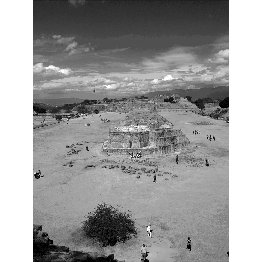
We spent the day climbing up and down the various pyramids, examining the place. There was a ball court, where a ritual game was played. There were locations for sacrifices, for celebrations, births, funerals, and so on.
All the buildings are rectangular except for this [↓] structure at the center. It’s also the only building that is meant to be entered. It was the astronomical observatory and used only by Zapotec astronomers (who were also, in a reason-meets-faith synchrony, Zapotec priests). Members of this sect would enter, look up, read the stars or the sun in the sky, and then emerge to announce what time it was. Time-keeping was a divine act for Zapotecs, received by astronomer-priests directly from the heavens.
The site is also heavily populated with writing that marks ceremonial sites and events, recording dates from 700 B.C. using the oldest known example of a Mesoamerican calendar. Inscribed in stone, either directly on buildings or on free-standing upright slabs (stela), the writing system is thought to combine logographic, ideographic, pictographic, even alphabetic glyphs. This is not unique, but the combination of all of these systems in one culture is rare.
February 7, 2022
Olivetti’s Interfaces
Olivetti’s Interfaces
Reading
Design-Interface.pdf (Gianni Barbacetto)
By-Design.pdf (Alice Rawsthorne)
Resources
Visitors
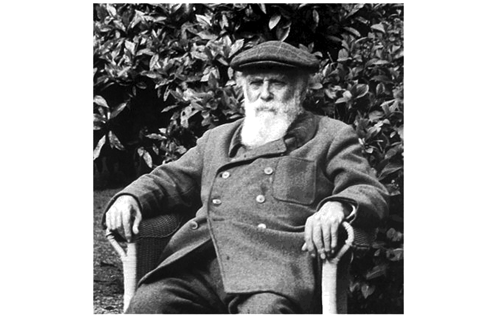
Camillo Olivetti [↙] was born toward the end of the 19th century in Ivrea, in the northwest of Italy.
He studied to be an engineer in Turin and left for what we now call Silicon Valley on a fellowship to Stanford University in the electrical engineering department. While there, Olivetti came across a new American invention he had not seen before: the Underwood mechanical typewriter. Olivetti was intrigued. He returned to Ivrea after completing the fellowship and joined up with a couple of childhood friends to set up a new company called Centimetro, Grammo, Secondo to manufacture precision instruments for measuring distance, mass, and time. This was a moment when manufacturing was ramping up in the industrial corridors of northern Italy, so precise devices to measure calibrations of finer and smaller degrees were in demand. It was also important to Olivetti to do this both with his childhood friends and in his hometown—he felt instinctively that a business has a direct responsibility to the context in which it operates. If successful, the company would provide jobs and prosperity to Ivrea. However, it wasn’t.
And so he returned to California for another stint at Stanford. This time he looked into the typewriter more closely, managed to make contact with people working on the machine, and returned to Italy with a complete set of blueprints. Olivetti set up another new company, the Olivetti Typewriter Corporation, which would design and manufacture the machines. Related to his thoughts on the responsibilities of a company to its context, he also believed it was important to understand typewriters within the *cultural context of writing,* the way that writing affects society and conversely, the way in which society shapes writing. Writing mechanistically changes things: you no longer use your own hand, one letter might look like another, the machine might even make writing more like factory work. So, although he had the blueprints for the machine, being an engineer Camillo redesigned it from the ground up.
The Olivetti typewriter [↙] was a completely different type of writing machine, one whose design aimed to make writing with it more individual, more pleasurable, more human.
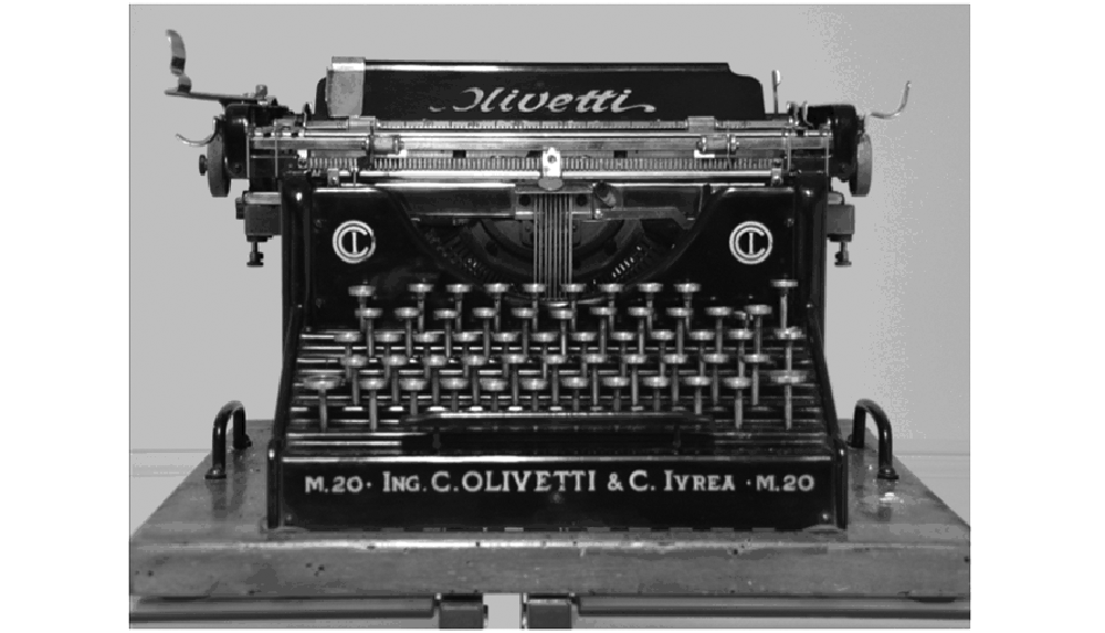
The Olivetti company became pretty successful pretty quickly and built a larger factory. Alongside the idea that its typewriters might make writing by machine more human, Olivetti also thought that the company must do something positive for its workers—provide jobs, produce an economic base for his hometown. Famously, the new Olivetti factory building was designed with large windows that face the Italian Alps so that the workers might look at the mountains as they assembled typewriters. Olivetti debuted the typewriter at the Turin International—a kind of World’s Fair dedicated to labor and industry—in 1911, where they showed not only the typewriters but all of the tooling and process plus biographies of the factory workers. It was, and remains, a distinct approach, a convincing approach.
February 14, 2022
You Will
You Will
Reading
Resources
When looking at interfaces I find it particularly useful to look at things that are out of date, that don’t clearly register in the current moment. It’s even better if these are from long enough ago that we’ve forgotten what screens looked like then. Interface design and graphic conventions both change and also cohere incredibly fast, so this isn’t hard.
Interface design is an explicitly speculative exercise, and so when looking at interfaces from the past we see what the present was supposed to look like. Sometimes these match our current situation, but often they don’t. In either case, the speculative interface design scenarios reveal desires for how we’d like our computers to behave. The fictions suggest uses we may have never known we wanted, but by articulating these as rendered design proposals, they often end up directly forming the interfaces we end up with.
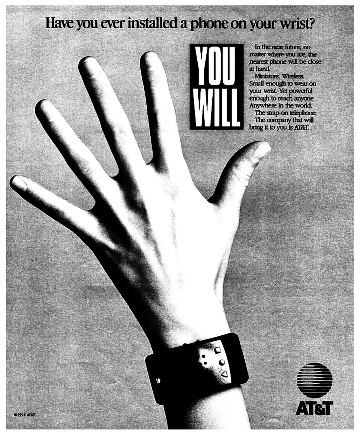
I’d like to look at a few of these interface design scenarios from a print and television campaign run by AT&T in 1993 called “You Will.” The ads describe and render a collection of interfaces coming sometime in the near future. At the time, these looked impossibly futuristic, but now, more than 20 years later, many, even most, are intimately familiar.
AT&T Ad 1: Have you ever borrowed a book from thousands of miles away? Crossed the country without stopping for directions? Or sent someone a fax from the beach? You will. And the company that will bring it to you, AT&T.
AT&T Ad 2: Have you ever paid a toll without slowing down? Bought concert tickets from cash machines? Or tucked your baby in from a phone booth? You will. And the company that’ll bring it to you, AT&T.
AT&T Ad 3: Have you ever opened doors with the sound of your voice? Carried your medical history in your wallet? Or attended a meeting in your bare feet? You will, and the company that will bring it to you, AT&T.
AT&T Ad 4: Have you ever watched the movie you wanted to the minute you wanted to? Learned special things from faraway places? Or tucked your baby in from a phone booth? You will, and the company that will bring it to you, AT&T.
What strikes me in watching these is that when working in interface design, the most consequential work doesn’t have a template — there’s no existing model. There are incremental advances in interface design perpetually put forward, like a better button design or a smoother loading widget, but these are driven more by a previous product than a comprehensive reimagination. The incremental designs respond to an existing interaction, rather than asking the more fundamental question of what the interaction could be. An interface can be radically reconceived, even just its visual vocabulary can suggest a completely different use.
Here’s one more [↓], a print ad which is particularly relevant.
The time right now is 2011 Feb 18 3:34 PM. The time stamped below reports 2012 Dec 29 18:43 PM. What’s going on? For the moment, just disregard the impossible chronology that these two suggest. the two times (of writing and of stamping) could never be precisely alike. each is a specific Point, and no two are ever exactly the same.
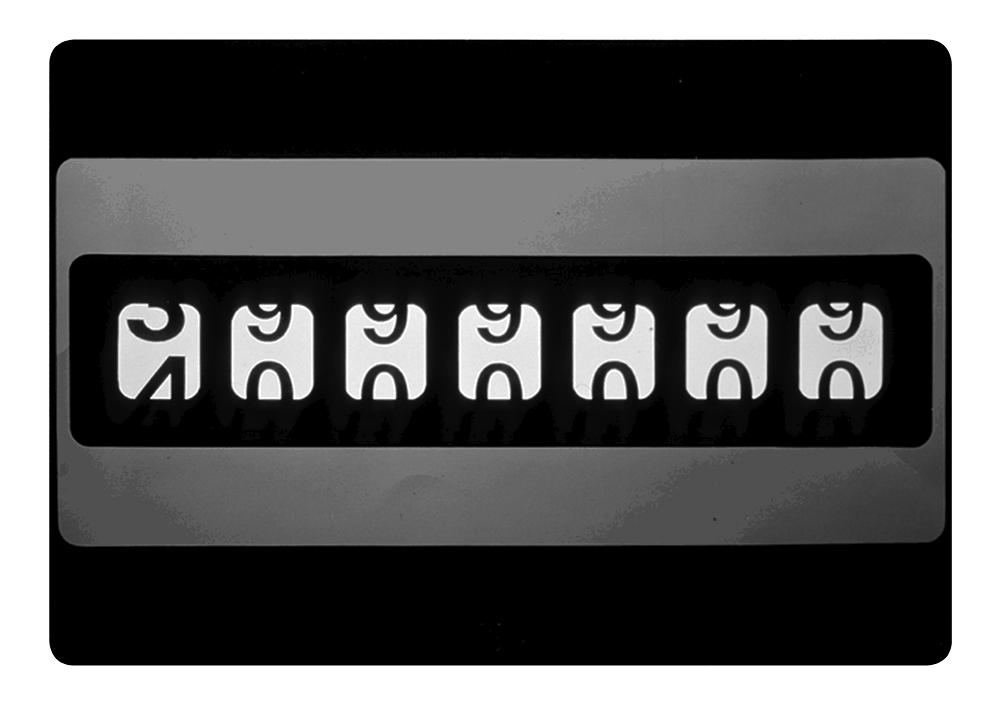
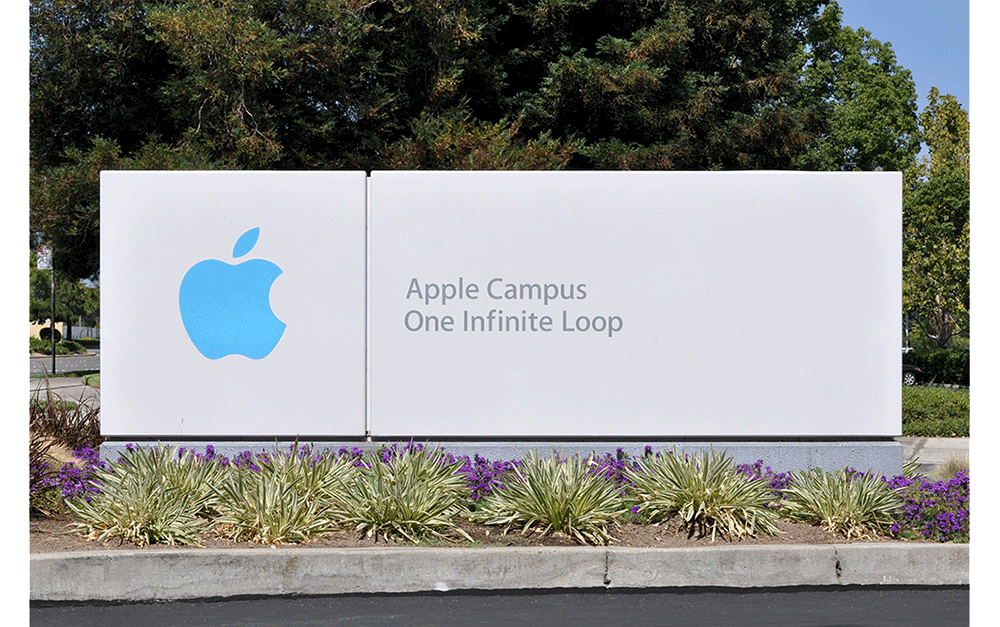
Both originate from the same source though—a networked time server maintained by Apple Computer and named, simply, time.apple.com. this external beacon commands not only the official time here on my macBook, but also synchronizes its local clock with those of apple users worldwide (laptops, desktops, phones, pods, pads, who-knows-whats-nexts). it’s easy enough to think of time.apple.com as a master clock, but actually it is itself only a network of time machines, a collection of counters comprised of a circuit of servers—computers named time1.apple.com, time2.apple. com, time3, time4, time5, time6 and time7. (the server my macBook is using right now (time4) is located at 20400 Stevens Creek Blvd. in Cupertino, California, just a few blocks away from apple’s appropriate corporate address, 1 infinite Loop.)
All of these servers communicate and agree what time it is at time.apple. com. But this covers only the United States, north and South america, and also must synchronize itself with time.asia.apple.com and time.europe. apple.com to provide a unified answer. all of this close coordination, communicated over distance and time, is governed by Network Time Protocol (NTP), a set of time-sharing conventions developed in advance of the World Wide Web in 1985, by University of Delaware professor Dr. David Mills. it is one of the oldest, and essential, internet protocols.
NTP runs as a Ponzi-scheme. each layer in the scheme organizes a set of time servers, who both receive the correct time from the layer above (each layer is properly called a “stratum” in the protocol) and also are responsible for dispersing the correct time to computers in the next layer down. at each level, more and more computers are connected.
February 28, 2022
“... meet the Tetracono”
“... meet the Tetracono”
Readings
The-Tetracone.pdf (Bruno Munari)
What-is-this-X-Hour.pdf (Bruno Munari)
Resources
I want to talk about a design research project that I worked on for the first half of 2017. The main protagonist is Bruno Munari and this will focus on one particular work I find particularly rich.
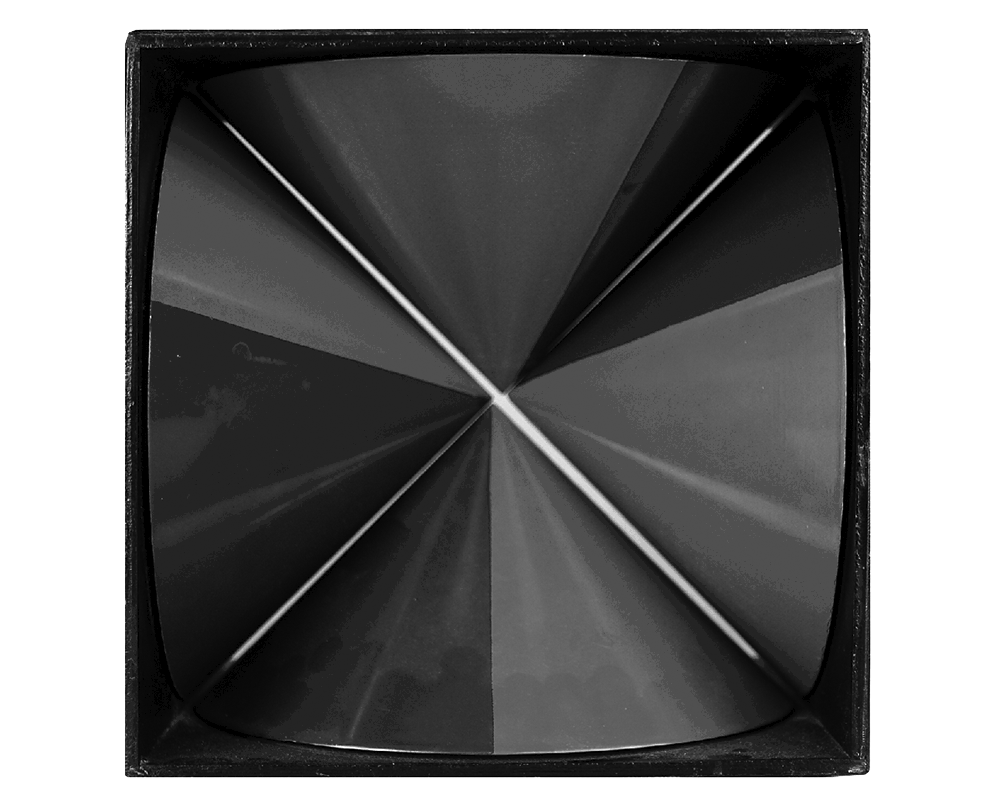
In 1965, Italian artist and designer Bruno Munari released the Tetracono [↑] with an event and exhibition at the Danese Milano showroom, inviting spectators to—quote—”... meet the Tetracono,” as if it was a person. But Tetracono is a product—an austere, 15-centimeter, black steel cube, housing four aluminum cones, each painted half red and half green, and designed to spin at four different distinct speeds on an 18-minute cycle. Its stated function was to show forms while they were in the process of becoming. My design research work around it included both historical research and also making things today. It was the result of six months spent as a design fellow at the American Academy in Rome, where I was given the time and space to investigate something. I’d been interested in this object for a good while and realized that I could talk about everything I wanted to talk about just through this one object. I also thought it’d be nice to spend six months looking at a 15-centimeter box.
So, the story begins around 1962. Munari was an artist, designer, writer, teacher, definitely an inventor, occasionally a curator. He was trained as an artist in Milan in the beginning of the 20th century. He associated himself with the Italian Futurists in the first quarter of the 20th century, but he came onto the movement late. And, in fact, he kind of quickly departed from some of their ideas.
He became increasingly disillusioned with fine art as a practice distinct from design or working in the world, at large, and was vocal about it. By 1962 he was writing a regular column in the Milan newspaper, Il Giorno. There, he called on his fellow artists to change their practice:
Today it’s become necessary to demolish the myth of the star artist.
He continues,
Culture today is becoming a mass affair, and the artist must step down from his pedestal and be prepared to make a sign for a butcher’s shop (if he knows how to do it).
That was a particularly blunt statement of what he had both implied and modeled throughout his career. This was the only way for art to again make contact with the public at large.
March 14, 2022
Rocking on your dime
Rocking on your dime
Readings
Resources
Visitor
I remember coming across this screen print somewhere soon after I started my own independent graphic design practice. It must have been around 2001 or so and I’d guess that my friend Mark Owens showed it to me, although I don’t really remember.
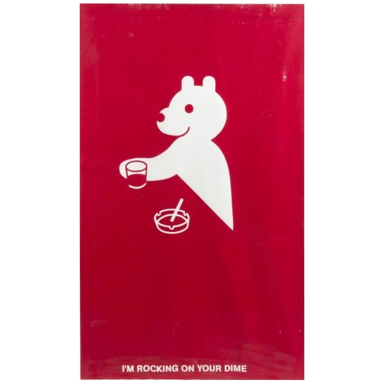
It’s the work of Geoff McFetridge, a singular and decidedly independent graphic designer who has, nonetheless, worked with a constellation of huge brands in projects from illustrations to logos to identities to film set graphics and film titles to packaging to sneakers to digital watch faces.
How do you work for others while also working for yourself? (Or maybe better, how do you do someone else's work while also doing your *own* work?)
I’ve struggled with the question myself, regularly. And here, this savagely cute gestalt bear sitting at a bar printed in one color and with pointed negative spaces looks like he has it all worked out. Perhaps he does. And perhaps so does McFetridge — in 2016, he won the National Design Award for Communication Design. Here, in his own words is what he does and why he does it:
Geoff McFetridge will join class via Zoom today.
March 21, 2022
Transparencia Index
Transparencia Index
Reading
Resources
Visitor
I'd like to call him a reverse engineer:
Federico Peréz Villoro takes apart technologies, interfaces, graphics to reveal what they hide, what assumptions and political dispositions are arranged inside.
On his website, Federico self-describes as an artist and researcher:
Through texts, performances, and digital artifacts, Federico explores the operational capacities of images as they become data and the ways in which state, corporate and institutional authority is administered through computational technologies.
The New York Times, August 1, 2021 calls him a journalist:
The photo projected on the screen in the conference room leapt out at him, of a woman against a pale blue background, wearing bright red lipstick and a beige hijab. Her name was next to the photo: Mena Yousif. Federico Pérez Villoro, an investigative journalist and artist based in Mexico City, wrote the name down so he could figure out who she was.
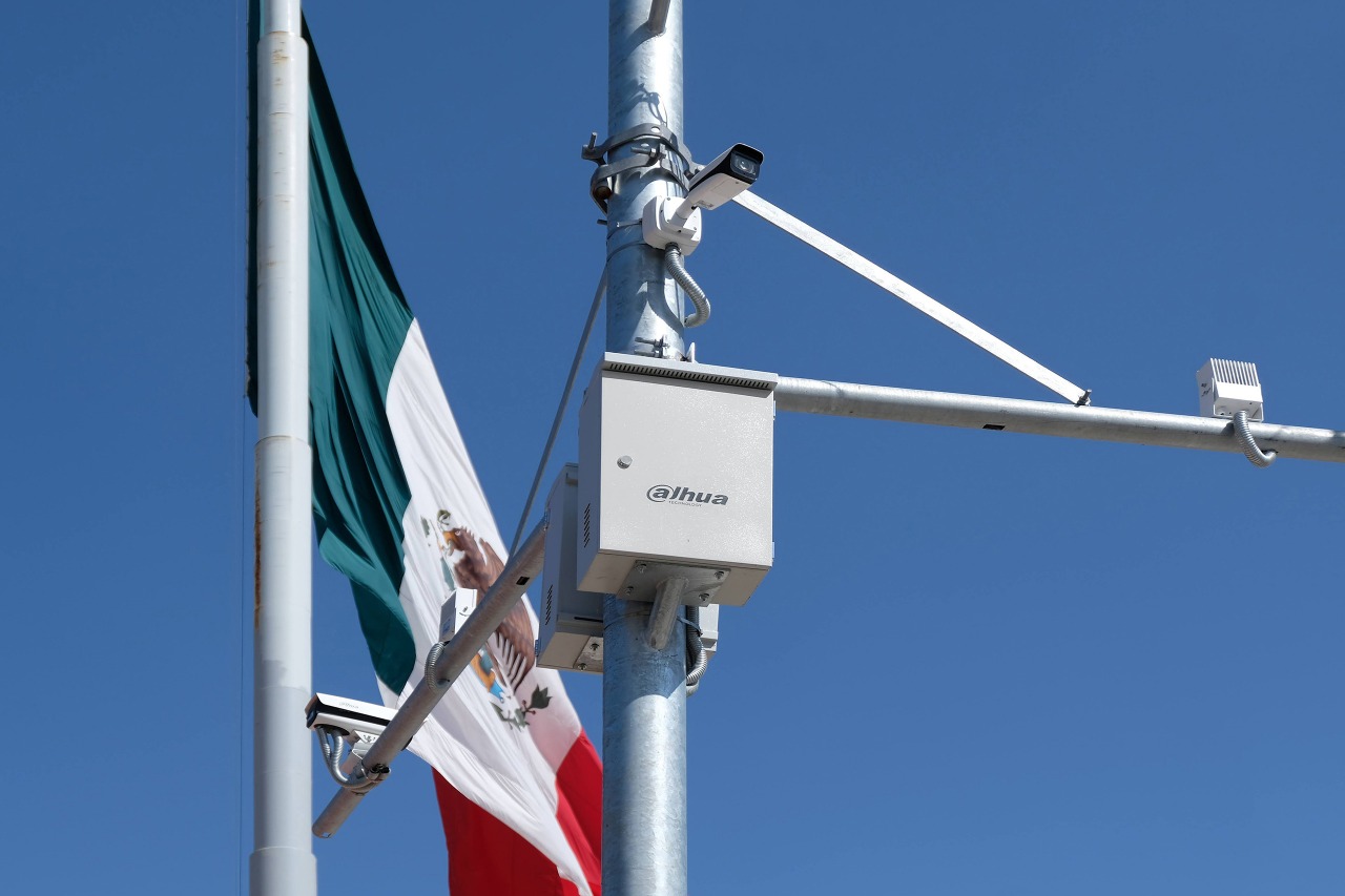
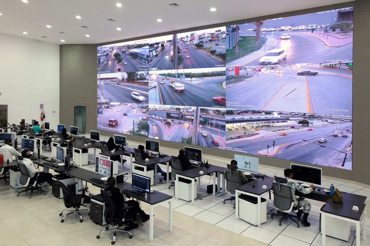
Like a good engineer, Federico also puts things together. And, in the process, reveals the cracks. Where things don't quite line up is also where the action is. For example, Transparencia Index is a recent work:
This project consists of a custom-made software that automatically scrapes data from the Plataforma Nacional de Transparencia, a system through which people can request public information from the Mexican government. The software identifies existing requests associated with topics of common interest that were previously denied on the basis of containing information "classified" by authorities. This ever-increasing flow of unanswered civic concerns are organized as an interactive website that aims to register, through labyrinthine hyperlinks, the bureaucratic opacity and strategic silence of the country's administrative institutions.
He organizes a summer school in México City (Materia Abierta). He makes typefaces. And exhibitions. And books. He will share some of all of this with us this week.
March 28, 2022
Design Noir
Design Noir
Reading
Design Noir (Fiona Raby and Anthony Dunne)
Speculative Everything (Fiona Raby and Anthony Dunne)
Resources
How to Build Scenarios (Wired)
This is a favorite design book [↓] of mine. Design Noir by Fiona Raby and Anthony Dunne was published in 2001. My copy is pretty beat up, well-used over any number of years. I always like the way that books with white covers inevitably show their age.
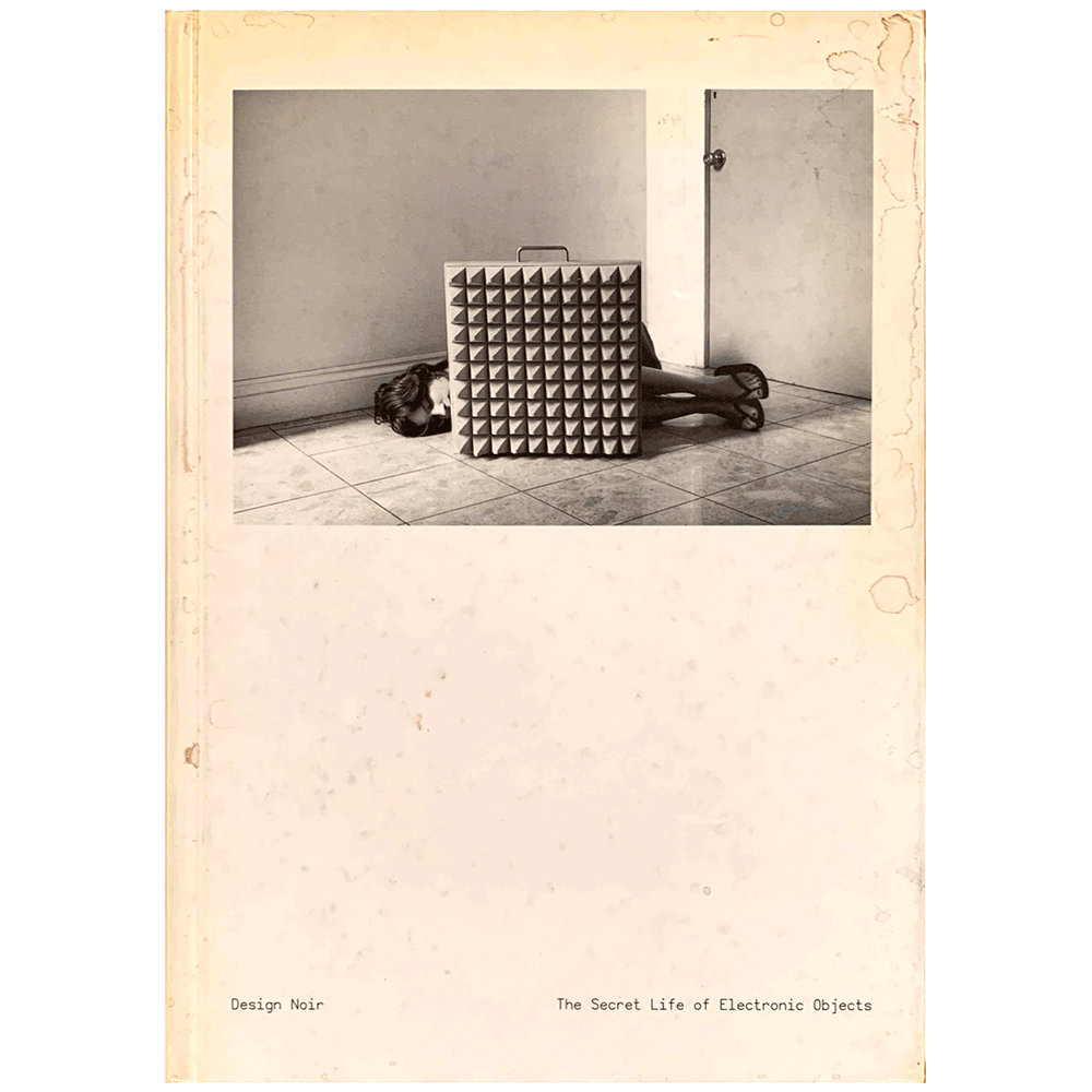
It seems appropriate given what that the book describes:
Beneath the glossy surface of official design lurks a dark and strange world driven by real human needs. A place where electronic objects co-star in a noir thriller, working with like-minded individuals to escape normalisation and ensure that even a totally manufactured environment has room for danger, adventure and transgression. We don’t think that design can ever fully anticipate the richness of this unofficial world and neither should it. But it can draw inspiration from it and develop new design approaches and roles so that as our new environment evolves, there is still scope for rich and complex human pleasure.
Corporate futurologists force-feed us a ‘happy-ever-after’ portrayal of life where technology is the solution to every problem. There is no room for doubt or complexity in their techno-utopian visions. Everyone is a stereotype, and social and cultural roles remain unchanged. Despite the fact that technology is evolving, the imagined products that feature in their fantasies reassure us that nothing essential will change, everything will stay the same. These future forecasters have a conservative role, predicting patterns of behaviour in relation to technological developments. They draw from what we already know about people, and weave new ideas into existing realities. The resulting scenarios extend pre-existent reality into the future and so reinforce the status quo rather than challenging it. Their slick surface distracts us from the dystopian vision of life they wish for. By designing the props for the videos produced to show us what the future could be like, design works to keep official values in place.
An occasional glance through almost any newspaper reveals a very different view of everyday life, where complex emotions, desires and needs are played out through the misuse and abuse of electronic products and systems. A mother shoots her son after an argument over which television channel to watch; a parent is outraged by a speaking doll made in China which sounds like it swears; the police set a trap for scanner snoopers — people who listen in to emergency radio frequencies illegally — by broadcasting a message that a UFO has landed in a local forest, within minutes several cars arrive and their scanners are confiscated. Many of these stories illustrate the narrative space entered by using and misusing a simple electronic product, how interaction with everyday electronic technologies can generate rich narratives that challenge the conformity of everyday life by short-circuiting our emotions and states of mind. These stories blend the physical reality of place with electronically mediated experience and mental affect. They form part of a pathology of material culture that includes aberrations, transgressions and obsessions, the consequences of and motivations for the misuse of objects, and object malfunctions. They provide glimpses of another more complex reality hidden beneath the slick surface of electronic consumerism.
April 4, 2022
Time as money as fonts
Time as money as fonts
Reading
Fonts-as-Money.pdf (Sarah Gephart)
Resources
Code-an-Essay.pdf (Paul Ford)
Visitor
As I meandered through my research, I kept thinking about what skill set designers could bring to the inequality problem. At the most fundamental, we deal in form, color, grids, and... type. With a healthy dose of creative thinking, fonts could be seen as behaving like cryptocurrency—they are bits of code which both sender and receiver need to have installed on their computers in order to see the fonts live, and they have a shared value to those users. What if you combined the motives inherent in local currencies with the technology of cryptocurrency, the mechanics of digital payments, and visual form of fonts? You might get a new system for local digital currencies that allows communities to set up their own network for exchange, where value is expressed both in numbers and in the form of the numbers. By creating a platform for a flexible system, different communities could build economic empowerment and self-reliance (similar to BerkShares and the Bristol pound) or develop a platform to exchange goods and services that are outside of formal markets (similar to the Spice network in the UK). Establishing the currency and its value would be in the hands of the individual groups using it rather than big global data hungry corporations. And similar to the Swiss franc, the visualization of the money can reflect community identity.
Using a different font for the numbers in each currency, means that the money for each community group is unique: the community gets to choose what their exchange looks like and their currency looks different from the next community. Money doesn’t have to look the same for everyone and for every purpose. Digital balances can have meaning besides just the number displayed: a value of 10 between office mates will look different from 10 exchanged at the local market; a heavy font could be selected for something important, a playful font for exchanging with friends. And Harriet Tubman can finally get her own currency.
People have long thought of money in different ways—money in a savings account is treated differently than a Holiday bonus, credit card debit is thought of differently than a loan to a friend—font money would allow people to see it differently too.
Recently, I find myself drawing a lot of 2s. It seems infinite how many variations you can make while still being legible. Of course, as people start to form exchange communities and choose their own font, people will choose what has value to them.
Does this solve financial inequality? Hardly. But I can’t help but think if there was a consistent yet flexible system for people to set up local exchanges we would inspire more community industry, pay people for work that is often unpaid, be less dependent on big corporations, be able to loan money to neighbors, and be able to see our exchanges as relationships between people rather than between banks. If we can actively participate in creating currency, will that help us see money differently? And would that affect our how we value objects, time, and our fellow human beings?
This is Muriel Cooper [↓] speaking at the 1994 TED conference in Monterey, California.
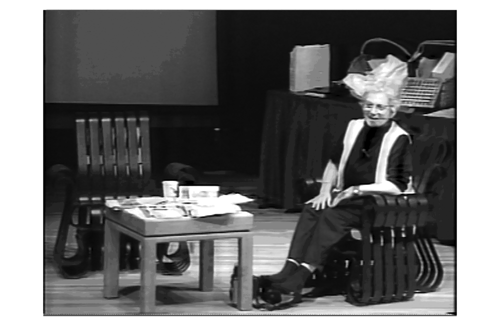
It was the fifth edition of the Technology, Entertainment, and Design conference founded by information architect Richard Saul Wurman, a close friend and colleague of Cooper’s. The TED conference drew heavy hitters from the overlapping worlds described in its title. Cooper was there to show the most recent interface design work coming out of the Visible Language Workshop in the MIT Media Lab, which she directed. Muriel Cooper’s loose but lucid TED talk looks a thousand miles away from the stage-managed, rehearsed, slick, and clickable TED talks on the internet today.
Muriel Cooper: Thank you. I have a couple of—can you hear me? I have a couple of personal things in characteristic with the TED philosophy. First of all, I’m testing the boundaries to see how truly comfortable one can make oneself here. She takes off her shoes and continues,
Our goal has been for a very long time to try to examine in the so-called emerging technologies what the new form and content of design, of communication, might be. And to that end for many years we have been building sort of prototype visualization tools that would allow us to do something that seems relatively intuitive in order to say “What if we did this, then what would happen?” but to really visualize this stuff in as tight and iterative loop as we possibly could. So we’re looking for the new design principles, umm, we’re not at all sure what they are ...
The talk proceeds in a knockabout fashion as Cooper and her student, David Small, eventually launch into a live demonstration of Information Landscapes, the most recent, and most exciting, work in the Visible Language Workshop. The software demo also goes around in circles a bit, but the work was overwhelmingly convincing to the audience. Spontaneous applause, and even an audible gasp or two, punctuated the presentation. Afterwards, audience member Bill Gates requested a copy, the work appeared on the cover of the design trade magazine I.D., with an article by Janet Abrams, and speaking requests piled up. This work seemed to be everywhere when I was working as a young interaction designer at IDEO San Francisco at the time. I’d like to come back to this work in a minute, but first some background.
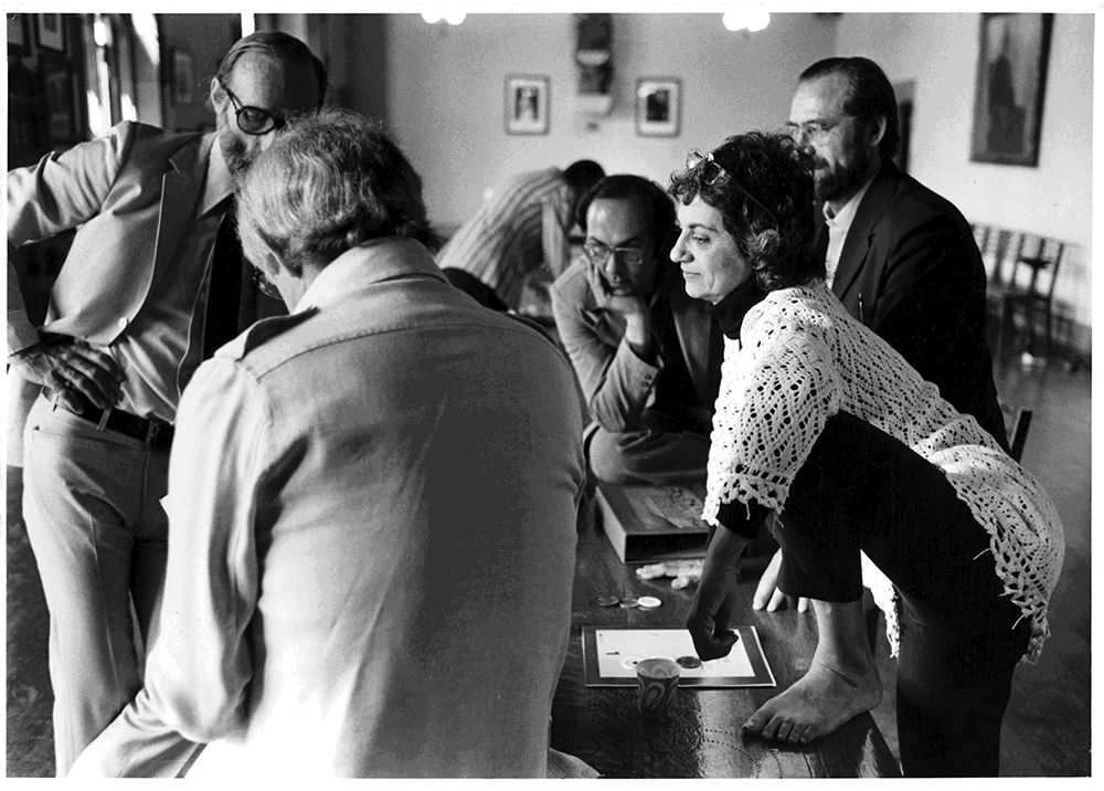
Muriel Cooper worked at Massachusetts Institute of Technology in various capacities over 40 years. MIT at the time was an overwhelmingly male and technical environment, and this made her work all the more difficult and important. Cooper asserted herself within this homogenous, community. Here’s a picture [↓] capturing a not unusual scene.
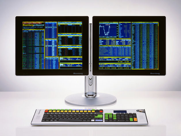
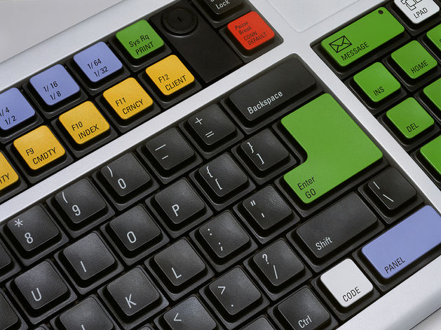
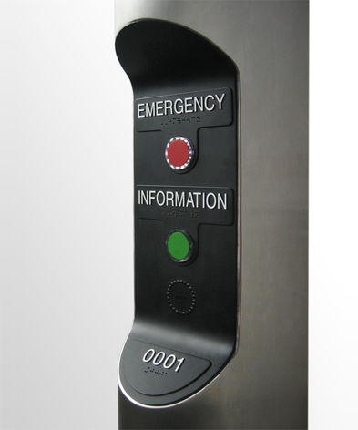
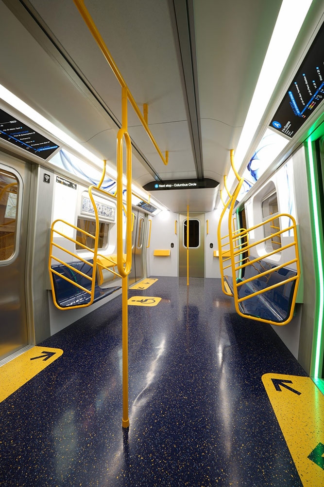
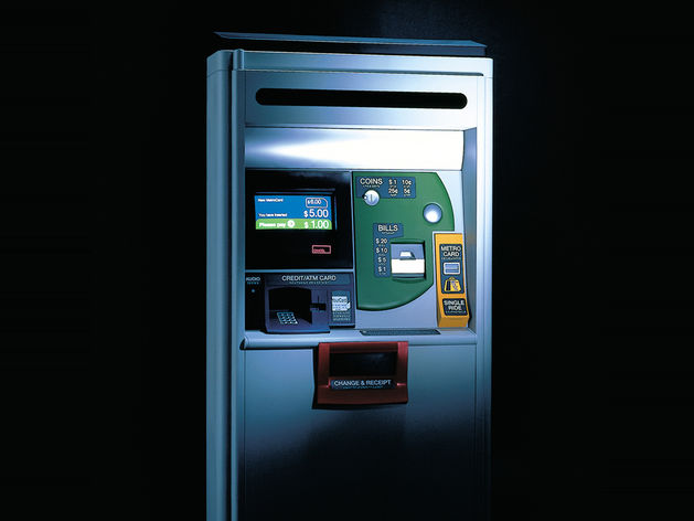
Antenna Design was founded in 1997 by Masamichi Udagawa and Sigi Moeslinger. Antenna's people-centered design approach aims to make the experience of objects and environments more meaningful and exciting. Projects range from public to commercial, from applied to exploratory. Antenna's design approach, incorporating rapid prototyping and user involvement, helps understand human behavior, which is particularly important when designing the unfamiliar, elicited by new technology.
In the public sector Antenna designed three new fleets of subway cars for New York City, all of which are in service now. Antenna has also designed hardware and screen-interface for various automated ticket vending machines for the Metropolitan Transportation Authority of New York.
Today, Masamichi and Sigi have graciously agreed to take us all on a a virtual studio visit.
April 25, 2022
Final review
Final review
Resources
Invited Guests
Stewart Smith https://stewartsmith.io
Bryant Wells http://www.bryantwells.com
Nazli Ercan https://nazli-ercan.com
Jonathan Zong https://jonathanzong.com
Bhavani Srinivas https://bhavanis.cargo.site
Eric Li http://eric.young.li
Link