When looking at interfaces I find it particularly useful to look at things that are out of date, that don’t clearly register in the current moment. It’s even better if these are from long enough ago that we’ve forgotten what screens looked like then. Interface design and graphic conventions both change and also cohere incredibly fast, so this isn’t hard.
Interface design is an explicitly speculative exercise, and so when looking at interfaces from the past we see what the present was supposed to look like. Sometimes these match our current situation, but often they don’t. In either case, the speculative interface design scenarios reveal desires for how we’d like our computers to behave. The fictions suggest uses we may have never known we wanted, but by articulating these as rendered design proposals, they often end up directly forming the interfaces we end up with.
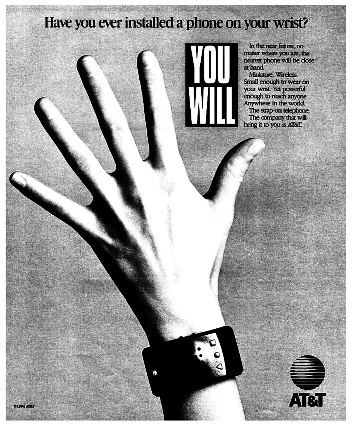
I’d like to look at a few of these interface design scenarios from a print and television campaign run by AT&T in 1993 called “You Will.” The ads describe and render a collection of interfaces coming sometime in the near future. At the time, these looked impossibly futuristic, but now, more than 20 years later, many, even most, are intimately familiar.
AT&T Ad 1: Have you ever borrowed a book from thousands of miles away? Crossed the country without stopping for directions? Or sent someone a fax from the beach? You will. And the company that will bring it to you, AT&T.
AT&T Ad 2: Have you ever paid a toll without slowing down? Bought concert tickets from cash machines? Or tucked your baby in from a phone booth? You will. And the company that’ll bring it to you, AT&T.
AT&T Ad 3: Have you ever opened doors with the sound of your voice? Carried your medical history in your wallet? Or attended a meeting in your bare feet? You will, and the company that will bring it to you, AT&T.
AT&T Ad 4: Have you ever watched the movie you wanted to the minute you wanted to? Learned special things from faraway places? Or tucked your baby in from a phone booth? You will, and the company that will bring it to you, AT&T.
What strikes me in watching these is that when working in interface design, the most consequential work doesn’t have a template — there’s no existing model. There are incremental advances in interface design perpetually put forward, like a better button design or a smoother loading widget, but these are driven more by a previous product than a comprehensive reimagination. The incremental designs respond to an existing interaction, rather than asking the more fundamental question of what the interaction could be. An interface can be radically reconceived, even just its visual vocabulary can suggest a completely different use.
Here’s one more [↓], a print ad which is particularly relevant.

February 14, 2022
You Will
You Will
Reading
Resources